Matters of Politics
Click Here for Full Screen And Interactive Data Viz
First look
This network represents all speakers that are American politicians, from 2015 to 2020, with Democrats in blue and Republicans in red. At first glance, this network seems pretty homogenous. We can see a few clusters here and there, but not much more.
 .
A cluster of Democrats in the graph. What links them is unclear.
.
A cluster of Democrats in the graph. What links them is unclear.
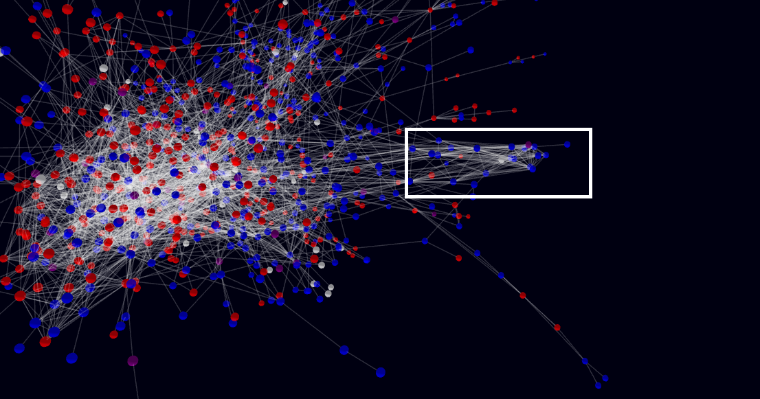
We can also see some isolated structures corresponding to local news, as in this component containing Michigan representatives.
 .
On the right, a cluster of politicians from Michigan
.
On the right, a cluster of politicians from Michigan
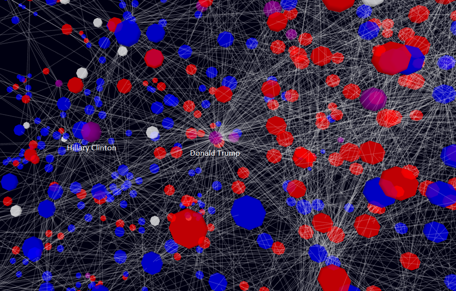
If we look at the centrl part of this graph, we find familiar figures.
For example, in this region, you see both Donald Trump and Hillary Clinton as purple nodes - both are qualified as both Republicans and Democrats by Wikidata.
 .
The center of the graph
.
The center of the graph
As you can see, Trump has a much higher degree than Clinton - no doubt due to the fact that he was has been president, and so was relevant for many more interactions.
Polarity
From simply looking at the graph, it seems that Democrats and Republicans are well-mixed. We can confim it by looking at the frequency of members of the same party in the neighbourhood of each node.
This frequency is, on average,
\(\bar{f} = \frac{1}{|G|}\sum_{x\in G} \frac{1}{|N(x)|} \sum_{y\in N(x)} = 0.599\)
Given that the frequencies of Democrats and Republicans are actually quite balanced, we should have \(\bar{f} = 0.5\) if the parties were distributed randomly on the graph.
Therefore, it seems that newspapers are slightly, if at all, more likely to quote together speakers of a same party.
This is actually a surprise : we would have expected the news landscape to be way more polarized than this.