Exploring the Graph
Click Here for Full Screen And Interactive Data Viz
Come with me pour une petite Balade
After having tamed 3d-force-graph, Quobank, and Python, we finally have nice graphs!
Now we propose you to have a little balade in this new landscapes, just to see how intuitive assumptions we could make thanks this type of data visualization.
We even put links to listen to some musics!
More specifically we will dive into different news sources.
Let’s start with NBC Sports (obviously we will see a lot of sportives)
Open you graph, select NBC Sports and choose the Occupation coloration.
We can first see 9 big clusters. But they are almost yellow, OUF! In a Sport news paper we mostly have sportives. But who are the non-yellow spot ?
They are some business persons, in red. One in a center of the cluster is Joe Lacob businessperson. I don’t know him, but he is surronded by basketball players and basketball coachs. Could we infer he posesses a basketball club? Let’s check on his Wikipedia Page. Oh Yes! By the way, we found a cluster which is basketball oriented.
Do the cluster correspond to sports?
Let’s check that, but first, why don’t we change the coloration? Let’s see the genders. HUMPF! It is note very mixed …
Green dotes (that correspond to Female) are very rare, only connected to 2 clusters:
- One is a cluster of basketball/American football players
- And the other one of ice hockey players
These female sportives seem to come only from Canada or the USA, where these sports are very popular.
Would we observe geographic trends if we color the graph by nationality?
Will we see an European cluster of football player typically ? Let’s try!
Well what we obtain is quite logic:
- the nationalities in the ice hockey players are USA, Canada, and Nordic countries like Sweden or Finland
- We did see an European/Uk cluster of football players (what a surprise)
It’s quite deceving to see that we do not have more exchanges between different sports.
Nevertheless, we see a blue/red/pink cluster (EU/UK/Australia) essentially made by racing automobile drivers. Daniel Ricciardo is one of the few representatives of Australia in this graph.
Why don’t we look into the graph generated by the Brisbane Times to see if Australians are better represented?
Let’s continue our adventure in the Land of Kangourous
A more colored graph indead!
Even if we have a dominant red center, on the edge a blue (Continental Europe) and pink (UK/Ireland) are present. We can even see some little Amerian clusters.
That would mean that the Brisbane Times offers the possibility to get quite international news (even if there are no nodes from Asia, or Africa/Middle East).
And if we have a look at the gender repartiton,
it seems globally equilibrated.
Except to branches, but if we look at the occupations, these branches correspond to sportives. So nothing very surprising according to what we noticed previously.
In fact, if we change the coloration according to the gender and the occupation, we can observe that the majority of the business people are men.
On the other hand, the gender is more equilibrated for the occupations of the public life.
Globally the socio-economic categories seem to be well covered
We have singers, choreographers, and some scientists.
And what about a more controversial news source like Breitbart?
The first thing we can observe is a dense core of business, public life and science people, which is surrounded by different clusters of sportives.
In a similar way, compared to what we saw in the first source,
sportives build clusters according to the sport they practice. There are not so many links between tennis players and basketball players for exemple.
Once again, if we look at the gender of the sport players, it’s quasi exclusively men …
By the way we have to a geographical clustering in the sport. Europeans are still related to football and automobile sports.
It’s quite striking to notice that Breitbart speaks about more sports than NBC Sports. For instance, we have golfers, cricket players, tennis players. An isolated cluster of rugby player is there too, can you find it?
What if we get closer to the non-sportive core of the graph?
As expected, we found a very connected node. It’s Donald Trump! Don’t hesitate to move its node to see all the edges he has.
Donald Trump is naturally connected to other politicians (like Donald Tusk, the former president of the European Council), business persons. But to scientists too! We can name Rosina Bierbaum, that worked on ecology and evolution and helped Barack Obama as Advisor on Science and Technology (The graph doesn’t allow to say how positiv their relation is)…
Anyway, you can still try to find unexpected connections.
By looking at the nationalities, you can see that the graph is quite polarized
Nodes are grouped by geographic origines which can make sense, as you have more chances to have contacts with someone of your nationality.
Before switching to the New York Times,
we can notice that as small cluster of people classified as artists is present. But in fact it’s essentially TV actors.
It seems that the Brisbane Times had relatively more artists. Let’s the to the New York Times
Is the New York Times a better news paper?
We are now used to see yellow sportive clusters, a bit apart. This is still the case even. (You can shake the nodes to see it better). There is a big cluster of baseball players by the way. NYC quite loves baseball apparently.
The other sport-clusters are:
- basketball
- ice hockey
- golf
- football
- tennis
- and racing automobile
So the NY Yimes seems to be a good news paper concerning sports even if it is not categorized as a sport-newspaper.
What do we have in the center of the graph?
Even if we have a majority of politicians, we can find writters, poets, scientists.
Unfortunately, this is the limitation of the graphs: even if with a few colors we can quickly catch what are the global interactions between types of people, we can’t go really into detail. Typically, we can’t say if the New York Times is a better news paper than Breitbart. But the reputation of the NY Times would suggest that this is what we should observe.
A little bit difference is that when we look at the nationalities, the central cluster seems a little bit less polarized than for Breitbart.
And when we try the gender coloration it seems
Scary mommy
This website is actually a motherhood/pregnancy-focused website, rather than a news site. It provides advice and testimonies to mothers and pregnant women.
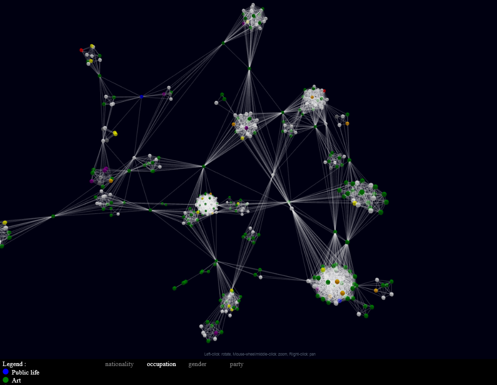 .
A view of the graph of speakers quoted at scarymommy.com, colored by occupation
.
A view of the graph of speakers quoted at scarymommy.com, colored by occupation
The first thing we see with this graph is that it is a lot more clustered than the others : there are strong, tight communities linked by a few ‘bridge’ speakers - an extreme case of a common property of real graphs.
A little research shows that these communities actually correspond to pages aggregating quotes : this one, for example, links together Neil Gaiman, Florence Welch, and Mark Rydell (amongst others) in a compilation of quotes celebrating the end of the week.
Another notable feature is the presence of numerous artists (in green) compared to the other news sites.
The speakers quoted on this website are also unusually dense, compared to the whole graph : 3825 edges for only 373 nodes - a density of only 2,7 %, but still 200 times more than the whole graph. This is due to the fact that each subgraph corresponding to a quote list is a complete graph, and so maximally dense.
Our Little walk along the Land of Graphs ends now
The Final, a motherhood focused website was quite unexpected, but the corresponding graph was intersting.