Graph analysis
In this section, we observe different statistics of our big graph. This preliminary analysis helps us to understand the properties of the graph and therefore get to know how to explore it.
General properties
Let’s start by the number of nodes and edges:
- Nodes: 118824
- Edges: 374240
First thing to notice, the graph is very sparse:
-
Sparsity = $\frac{ E }{ E_{max} }$ = 0.01%
As we want to do clustering, we take a look at the connected components.
- There are 4 connected components
- There are 3 small connected components (size 10, 13 and 13)
- There is on big connected componenents of 118788 speakers
It looks like we can not rely on connected components only.
Degree
Who are the main speakers of our graph ? Are people very connected ? Let’s figure this out !
def plot_degree_distribution(G):
    degrees = {}
    for node in G.nodes():
        degree = G.degree(node)
        if degree not in degrees:
            degrees[degree] = 0
        degrees[degree] += 1
    sorted_degree = sorted(degrees.items())
    deg = [k for (k,v) in sorted_degree]
    cnt = [v for (k,v) in sorted_degree]
    fig, ax = plt.subplots()

    plt.bar(deg, cnt, color='b', log = True,ec = 'b', align='edge')
    plt.title("Degree Distribution")
    plt.ylabel("Frequency")
    plt.xlabel("Degree")
    plt.show()

    fig, ax = plt.subplots()
    plt.bar(deg, cnt, color='b', log = True,ec = 'b', align='edge')
    plt.title("Degree Distribution (log-scale)")
    plt.ylabel("Frequency")
    plt.xlabel("Degree")
    plt.xscale('log')
    plt.show()
plot_degree_distribution(G)
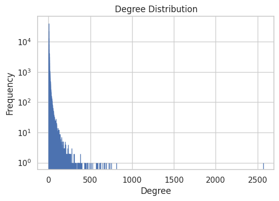
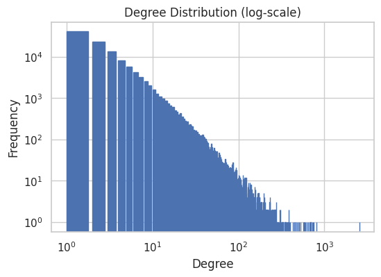
Most of the speakers have very low degrees, but some have very high degree. Indeed the degree distribution is following a power-law, which is typical for real world networks.
Who are those very famous people ?
degrees = dict(G.degree(G.nodes()))
sorted_degree = sorted(degrees.items(), key=itemgetter(1), reverse=True)

for speaker, degree in sorted_degree[:10]:
    print(G.nodes[speaker]['name'], 'is linked to', degree, 'people')
Donald Trump is linked to 2570 people
Narendra Modi is linked to 812 people
Emmanuel Macron is linked to 752 people
Nancy Pelosi is linked to 733 people
Mike Pompeo is linked to 718 people
Boris Johnson is linked to 692 people
Andrew Cuomo is linked to 690 people
Benjamin Netanyahu is linked to 669 people
António Guterres is linked to 646 people
Justin Trudeau is linked to 620 people
The Top 10 central speakers in our graph are very famous country leaders. We could have expected this, especially that Donald Trump is the most central.
Clustering
Are there obvious and interpretable clusters ?
We use Louvain clustering method to check either we can identify interpretable cluster:
- the partition results of 543 clusters
It’s a too large number for us to interpret each group by hand, we then focuse on attributes.
Homophily
Which speaker attributes could be useful to filter on ? We compute the homophily with respect to gender, nationality and political party.
The homopholy estimate the similarity of connections in the graph with respect to the given attribute.
Results of homopholy:
- gender: 0.225
- nationality: 0.404
- party: 0.321
Those results show that nationality is a good attribute to observe clusters. Indeed on the 3D graph we clearly distinguish clusters of speakers with the same nationality.